Splice
Instrument
The Challenge
Years of rapid growth prioritized shipping features and expanding the library, but the visual and behavioral language of the platform no longer reflected how musicians actually experience creativity. The product worked, but it felt fragmented. Different surfaces spoke different dialects, creating unnecessary friction and weakening emotional connection.
The challenge was not to make Splice louder or trendier, but to create a product-facing system that could unify tools, content, and communication without slowing velocity or limiting expression.
Users
1. At one end are professional producers working on commercial releases.
2. At the other are emerging musicians building confidence and learning the language of production for the first time. These users differ dramatically in skill level, genre, and workflow, but they share a need for clarity, speed, and creative momentum.
The system needed to support both extremes simultaneously. It had to feel welcoming without being simplistic, expressive without being chaotic, and consistent without feeling rigid.
The Approach
We treated identity as infrastructure, not ornamentation.
Instead of separating brand and product, we designed a shared system that could live inside the product itself. Every decision was evaluated against how it would behave across real use cases, from dense browsing interfaces to feature launches, social content, and future tools that did not yet exist.
Workshops and working sessions with product, brand, and leadership teams helped establish a single experiential north star: Splice should feel like a creative environment built by musicians, not software that merely hosts music.
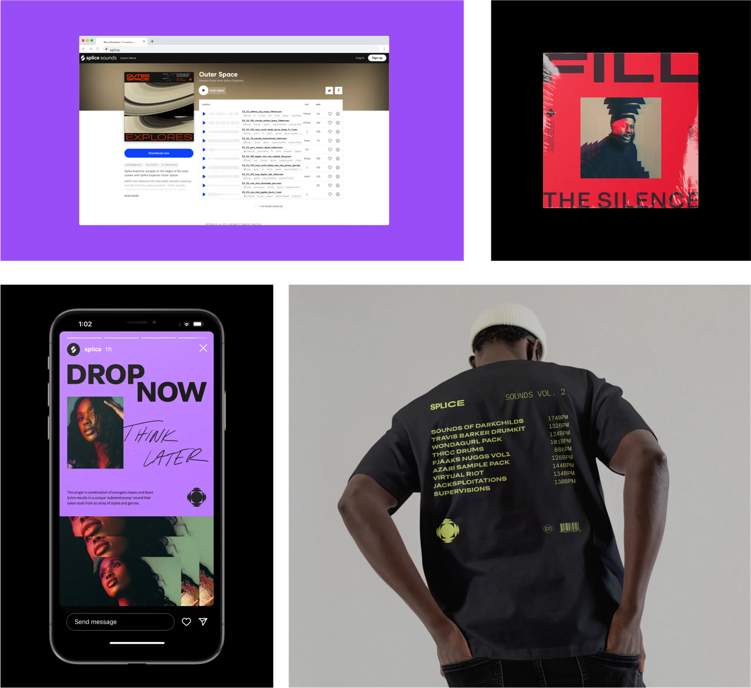
The visual system was designed to behave like music.
It needed rhythm, variation, and structure, all at once. Modular components allowed layouts to respond to different types of content without losing cohesion. A flexible icon language extended the existing mark into a broader functional vocabulary. A custom variable typeface balanced expressiveness with legibility across complex interfaces.
Color was treated as an active navigational tool, reinforcing hierarchy and emotion rather than acting as decoration. Photography and image treatments emphasized repetition, fragmentation, and echo, mirroring the mechanics of sound and sampling.
As a systems designer, my role focused on ensuring these elements worked together as a cohesive language that could scale without constant redesign.
The System


Splice gained a system that unified how it appears across product, marketing, and community touchpoints, reducing ambiguity for users and increasing internal alignment. Teams were able to move faster with greater confidence, using a shared language that supported both experimentation and consistency.
Rather than freezing the brand in time, the system was designed to evolve alongside the product. Today, it continues to guide how Splice introduces new tools, communicates with its audience, and supports creative exploration at scale.