m(ux)
My Takeaway
Music is extremely powerful, so working on a music event from scratch was incredibly fun. This project let me take full ownership of the branding from start to finish, which helped sharpen my art direction skills. Designing for m(ux) felt natural because music and design share the same sense of rhythm and emotion. My goal was to create a visual identity that matched the energy of the event, bold, playful, and built to move.

Two friends reached out to me with an idea that immediately sounded awesome. They were building m(ux), a music-driven event meant to celebrate alternative electronic culture and unfiltered artistic expression. They wanted a brand identity that felt as experimental and fluid as the artists it represented, something bold, inclusive, and alive with creative energy. My role was to take that vision and translate it into a cohesive visual language that captured the spirit of discovery, freedom, and community at the heart of m(ux).

The visual direction for m(ux) was rooted in creating something that felt unapologetically playful, nostalgic, and high-energy while maintaining a sense of cohesion and intentionality. Every design choice aimed to communicate that m(ux) is not just another music event—it’s a creative playground that blurs the lines between digital, nostalgic, and subcultural aesthetics.
The palette is centered in hot pink, supported by mint green, powder blue, and bright yellow. These colors create a sense of joy, rebellion, and creative freedom. The combination evokes early 2000s pop culture. Saturated, candy-coated visuals that balance chaos and clarity. Pink serves as the brand’s emotional center, symbolizing vibrancy, inclusivity, and fun, while the surrounding pastels add dimensional contrast and visual relief.

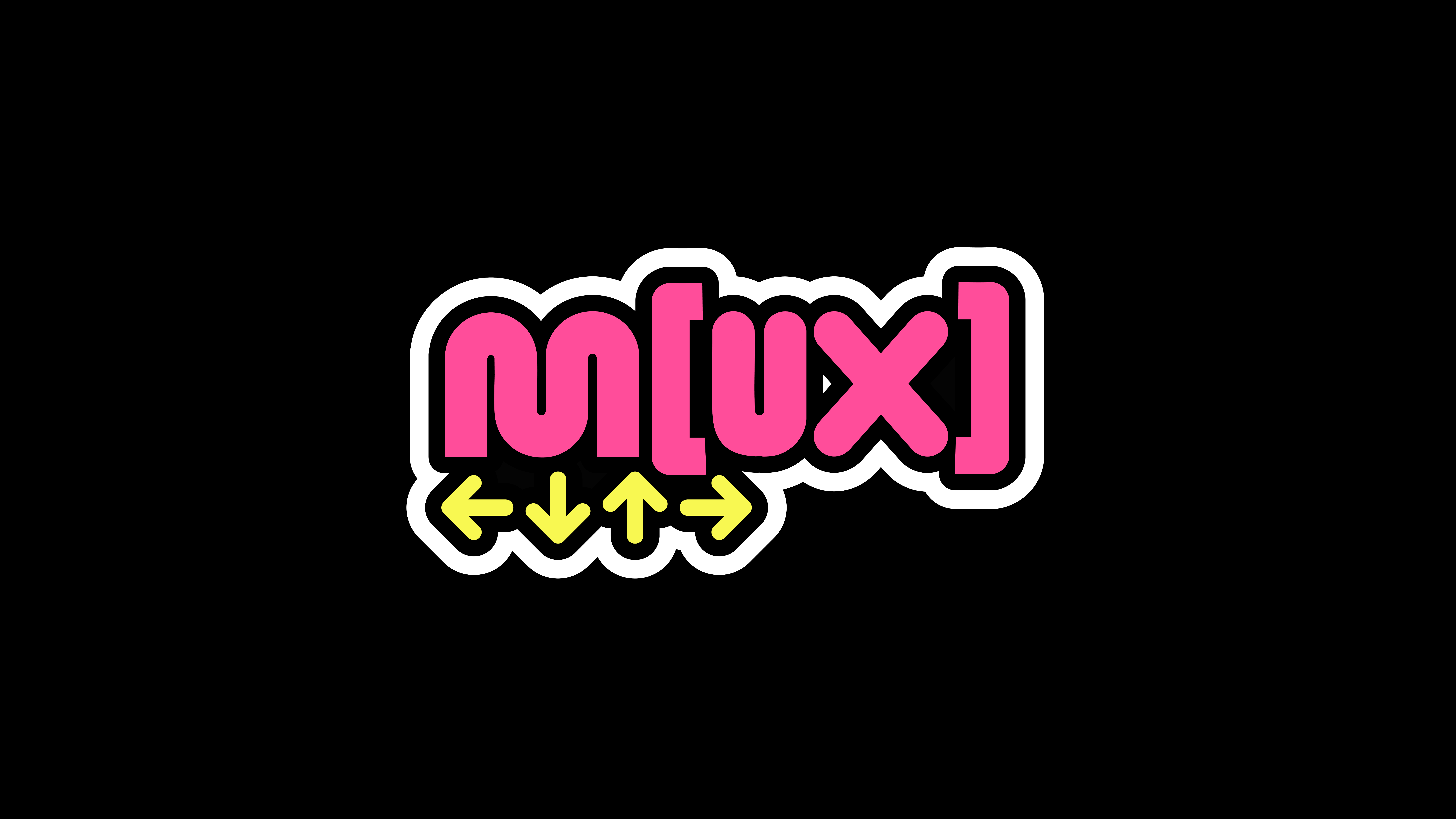
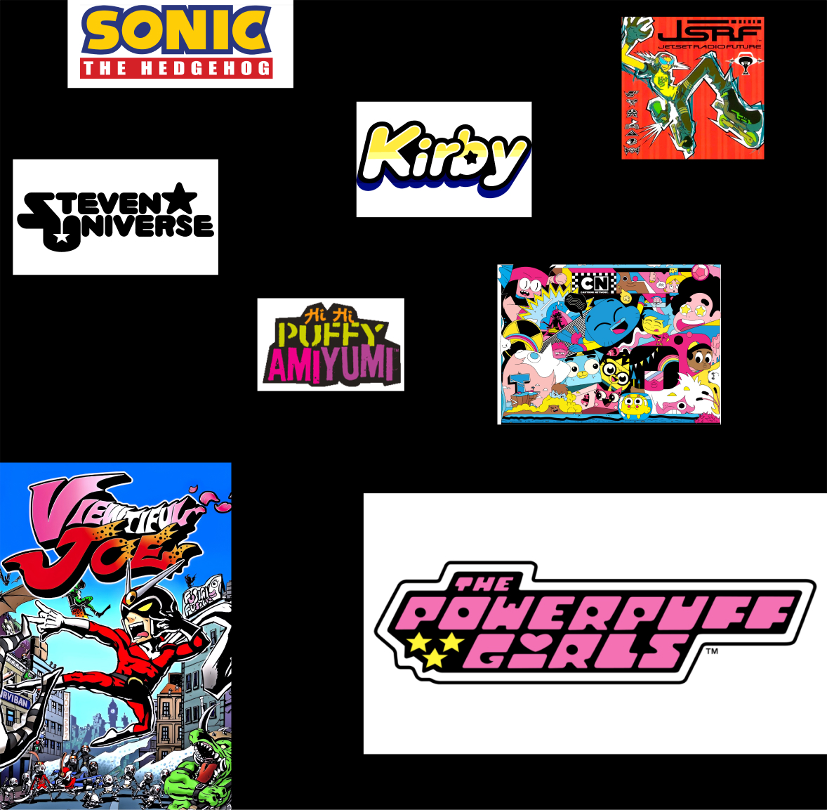
The logo’s rounded letterforms are inspired by early 2000s character design and game culture, think Powerpuff Girls, Kirby, Jet Set Radio Future, and Hi Hi Puffy AmiYumi. The use of soft, inflated shapes keeps the tone friendly and expressive rather than overly sleek or digital. The bracketed “m[ux]” structure plays with modularity and programming language references, suggesting a “multi-format undefined expression,” aligning perfectly with the event’s mission of creative fluidity.
The visual direction heavily draws from Y2K Japanese pop aesthetics and Western cartoon culture. It intentionally sits between Cartoon Network’s maximalist chaos and Sega Dreamcast’s hyper-stylized futurism. The result is a visual identity that feels both familiar and futuristic, a callback to youth culture reimagined through a modern lens.


